

We’re looking for your feedback on our first design.
Just in case you don’t know . . .
For the past few years, my brother Michael and I have been designing FUSION: Space Combat. FUSION is a tactical ship-to-ship combat game set in the 23rd century. Pilots fly massive starships for competing agencies by fusing their consciousness with the starships, issuing commands to travel, arm weapons and launch attack drones.
There’s a bit of a Japanese influence in the game world so the starships are named after Japanese weapons such as katana and shuriken.
The Graphic Design
The design needs to be user friendly, look cool and ‘deadly’, but convey some sense of the pilot’s interface with their starship. So each design looks like a user interface or HUD.
Looking for feedback
We’ve worked for some time on the graphic design and layout of the game and have decided to focus our efforts on the starship mat to help us pick a consistent style for all the graphic design. The starship mat is a real focus of the game because you manage skills, time and resources on the mat.
We feel if we can lock down the design of the starship mat this can influence the design of other collateral such as the cards, main combat board, and other pieces.
The artwork consists of pictures I’ve worked on or 3D models purchased with a commercial use license that I’ve lit and rendered in Maya.
Recently we showed the mat to a couple of friends and fellow gamers who have been generously lending their time to play-testing the game. Their feedback was invaluable in making us realise so many logical aspects of mat design that we hadn’t considered.
Now we’d like to see if you can help us too. We’re looking for feedback on various potential versions of the Starship Mat design I’ve sketched.
Is there a design here that makes you want to play the game? Perhaps you don’t like any of them, feel they’re bland, think the colour schemes are awful? Either way, we’d love to hear from you.
Are there some elements that work, and others that don’t? Maybe we need to combine parts of one with parts of another.
Without further ado, here is the five possible designs for the starship mats.
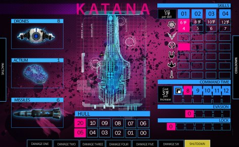
KATANA ONE: PINK
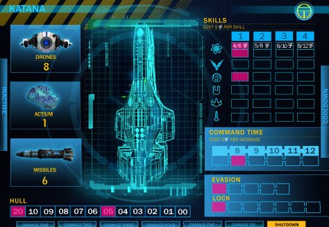
KATANA TWO: WIREFRAME
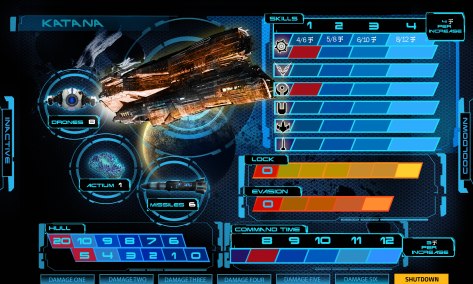
KATANA THREE: TRANSPARENT

KATANA FOUR: NETWORK LINES

KATANA FIVE: COMPACT
We look forward to your feedback in the comments below.

Hey Ondrew – I can’t believe you’ve been doing this for so long and I had no idea!! So amazing. As you know gaming etc isn’t so much my shtick so just giving feedback on a personal taste level…which probably isn’t that helpful. Firstly these are awesome and the game sounds so interesting! I’m a fan of #2 or perhaps elements of #2 and #1 combined. I just find #2 clearest – though visually I don’t love the yellow and black banner top left. With #1 the pink heading at the top puts me off as it looks like it’s hanging there rather than integrated with overall layout. I love the background image in this one because it looks like some amazing intergalactic mould (in a good way) but perhaps too pink for me – could you invert the colour or something with this. Overall I wonder if you have too many colours in the palette of each spread? Say in #2 I’d like to see what the yellow headings look like replaced with the same colour of the actual spaceship (the teal-y colour).
I like overall how it’s got a bit of a Japanese infographic vibe going on – I’d be trying to streamline this further but also my aesthetic is more along the lines of modernist/minimalist vibes which perhaps don’t suit the subject matter as much.
xx jes
LikeLike
Hi Jes,
Thank you so much for these thoughtful comments. Getting design/aesthetic feedback from someone with your background in art, and especially interactive art, is extremely valuable.
You’ve actually managed to pick out the issues that I’m most concerned with in terms of the look of the mats. Namely my control of palette and whether the elements are integrated enough. I want to control the colours and the elements so they evoke an atmosphere but are minimalist and relatively clean. So, yes streamlining the design is definitely the nest step. If we do pursue design number 2 I’ll definitely be reducing the colour range and using the teal colour for the titles.
Thank you again. I hope you won’t think of it as too much of an imposition if I ask you for more feedback in the future.
LikeLike